Saturate with Color
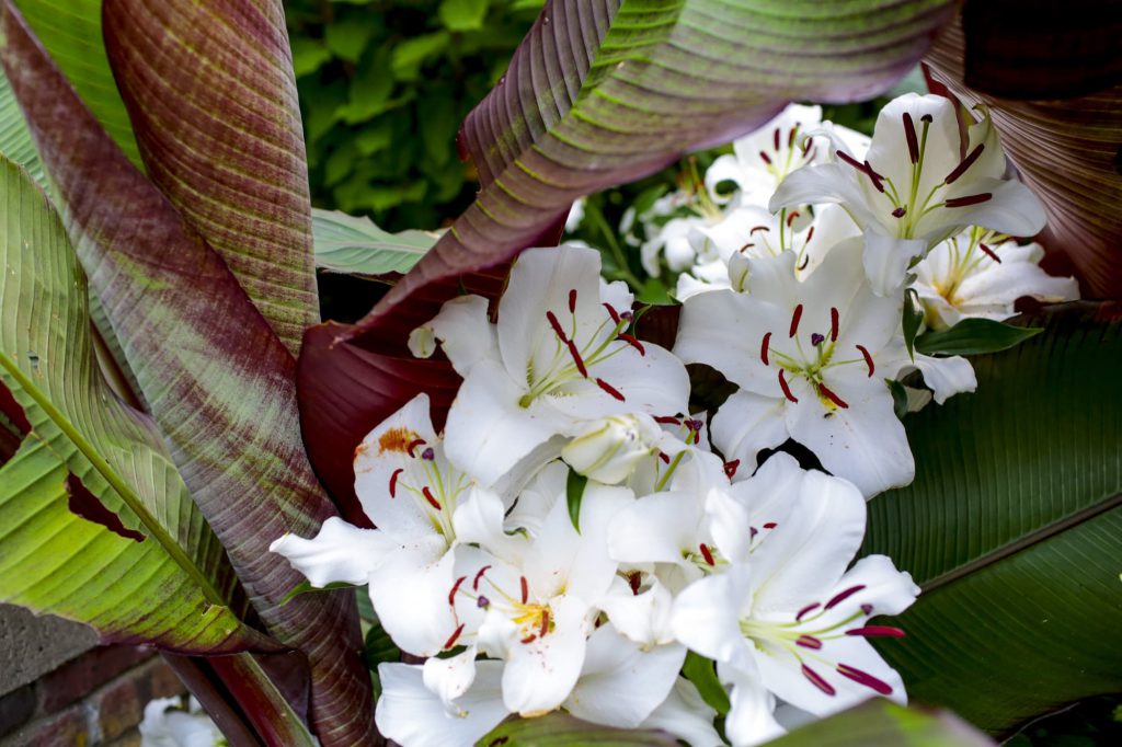
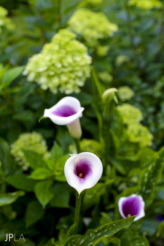
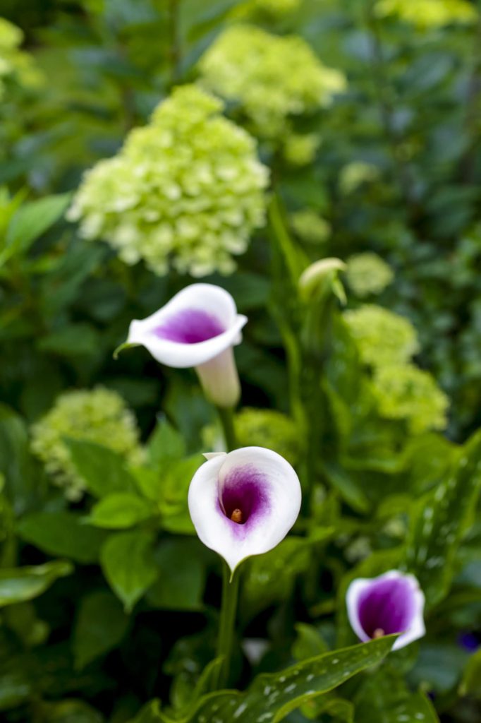
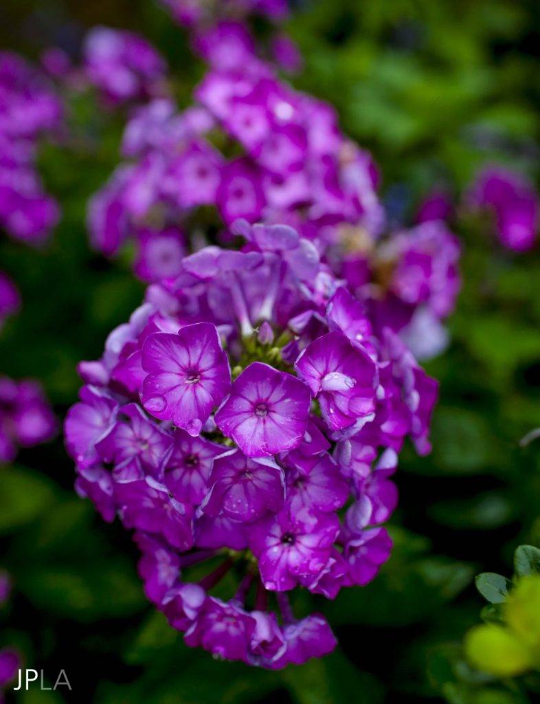
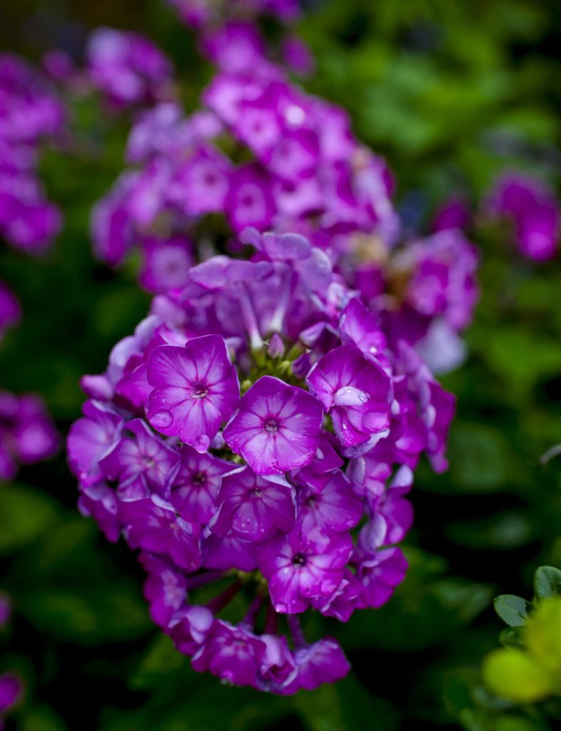
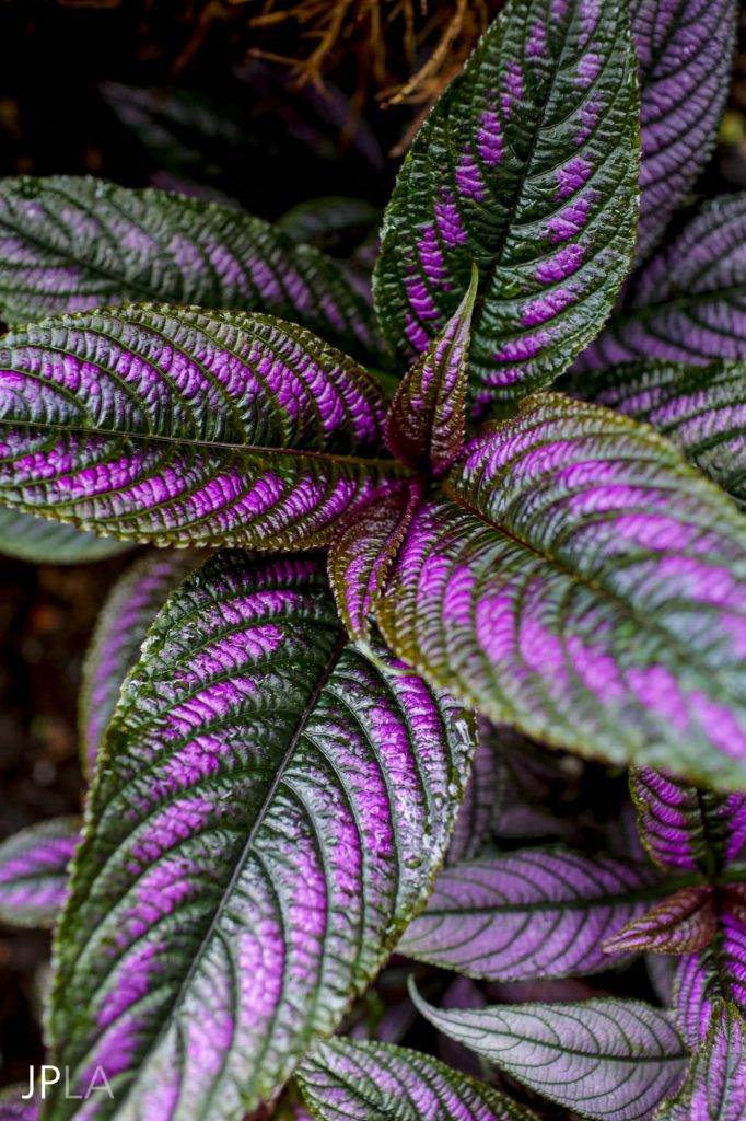
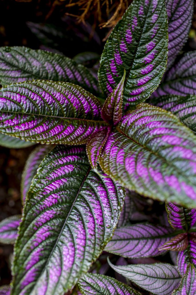
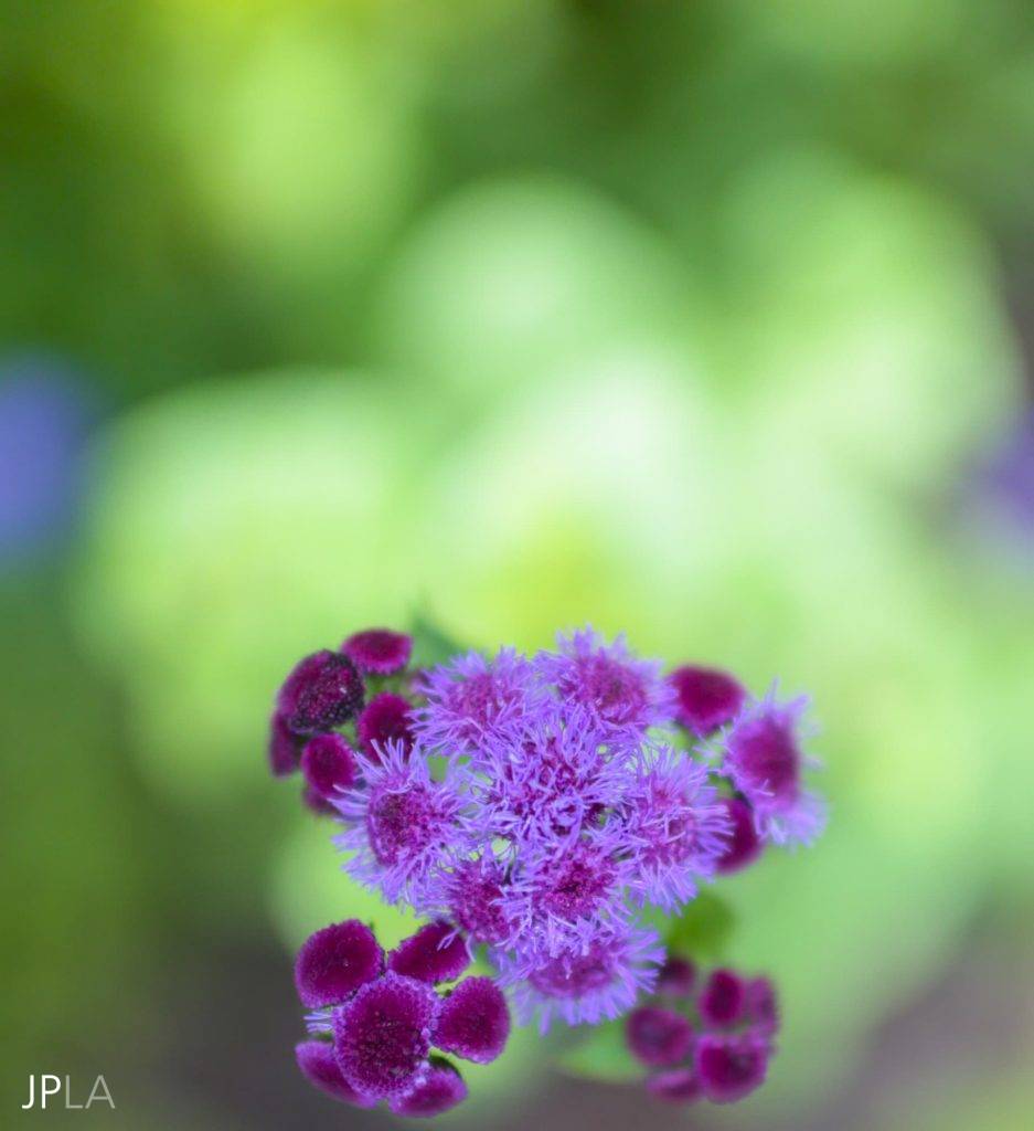
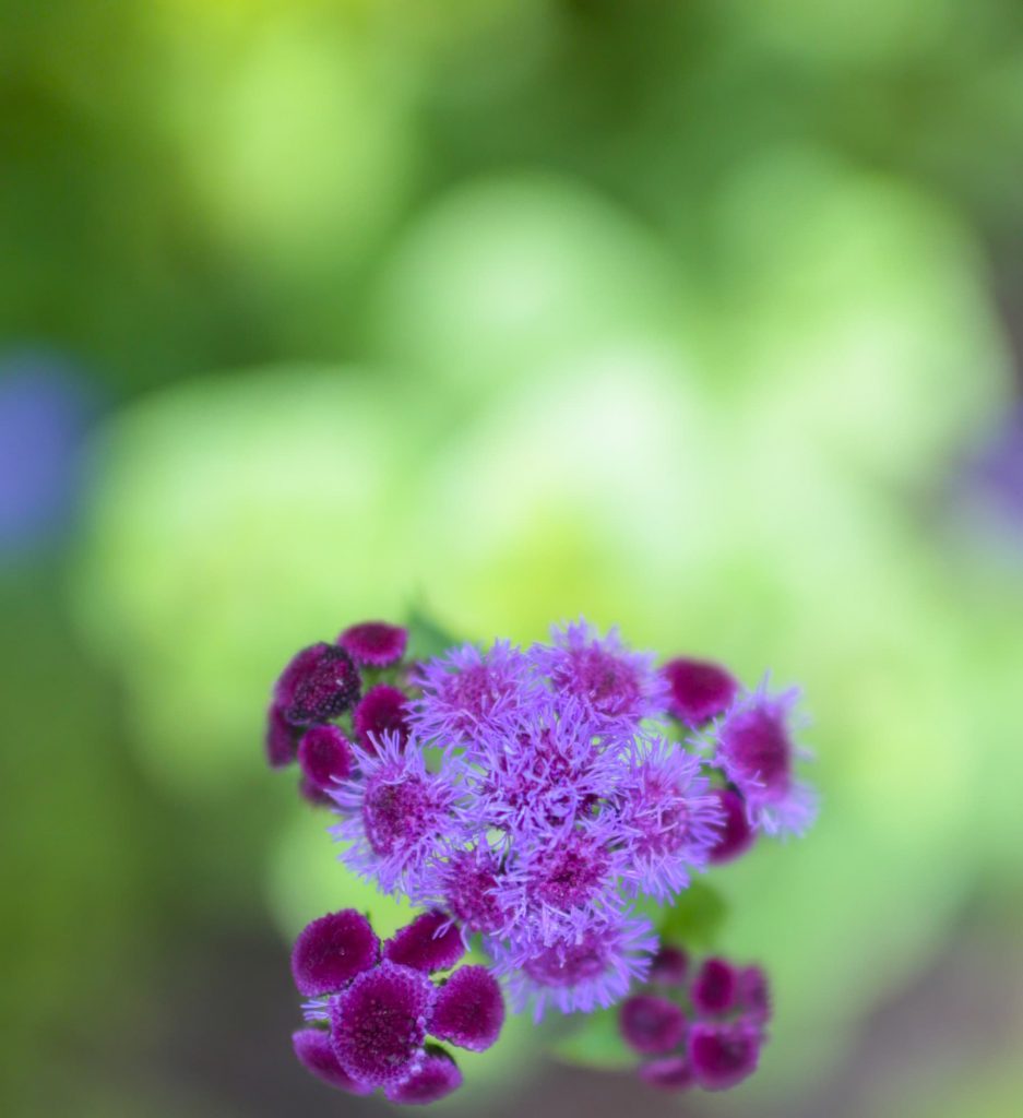
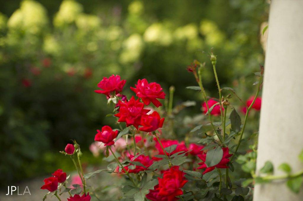
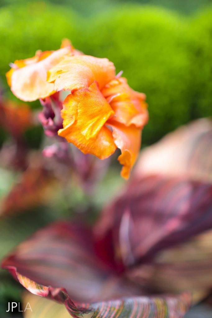
So much has been written and said about color in the garden. I find it all overwhelming. As a floral designer first and a landscape architect second, I learned early on that there are no rules about color that can’t be broken. I believe “Go big or go home!” is applicable to the use of color in the garden. Be bold!
My first year in the back room of a busy and stylish flower shop in New York City taught me that all my rules were meant to be bent, if not completely tossed out. As I learned to feel and manipulate the natural flowers, branches and plants in the art of floral display I began a long relationship with the essence of the plant material. One thing to remember is to strive to think as big as possible about our landscapes – growing out of display, flower borders and gardens into the realm of landscape, not ornamental horticulture. So the color in your gardens in a circular path – from the precious connection to a lilac bloom to the birds eye view down from 100 foot high. Understanding how our land connects with the larger story of our environment is the backdrop.
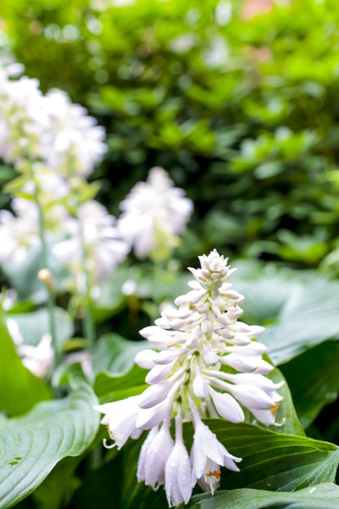
If you are looking for an all-white or green garden, I am not the one to come to. It can be an interesting study to do one color gardens, I have done them. However I am sure that nature did not put all the fabulous plants and flowers on this earth and then expect us connect with just a few – or just the ones that are local. Nature is a giant paint box and it is too tempting to resist.
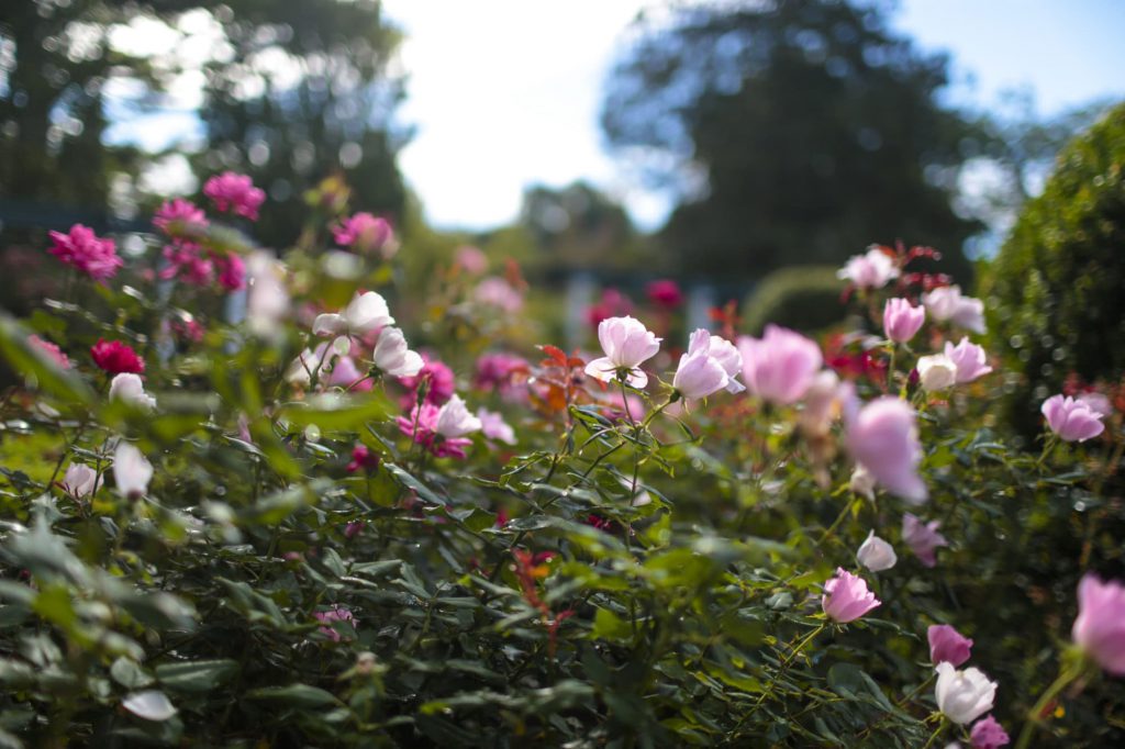
A garden is about color – the scene, the light, the volumes of space are all in color. Classic color theory is important to understand, but a personal adventure with color is vital and an integral part to being in a deep relationship with nature.
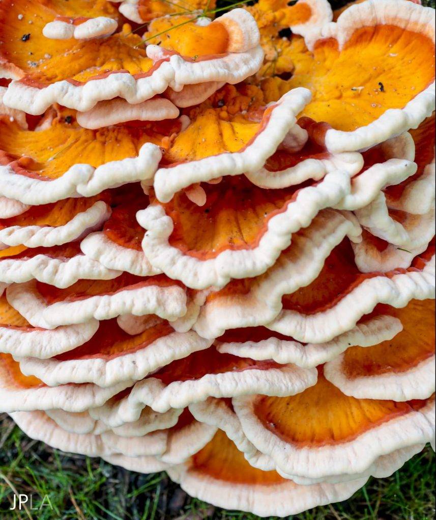
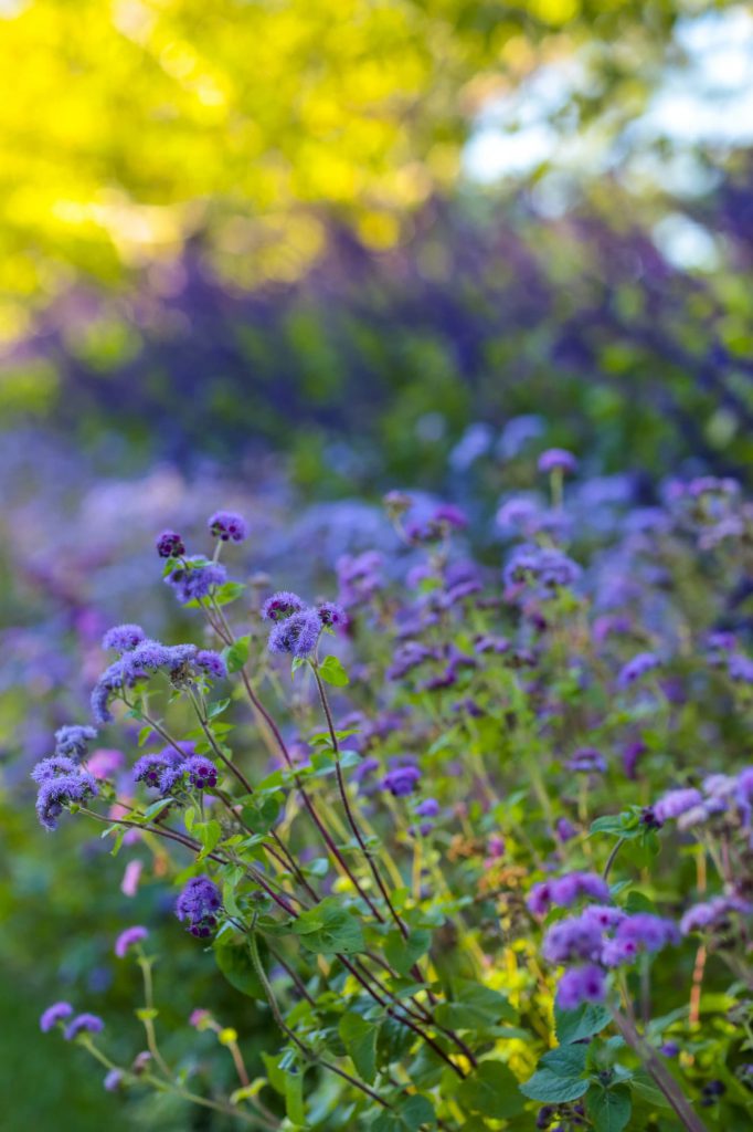
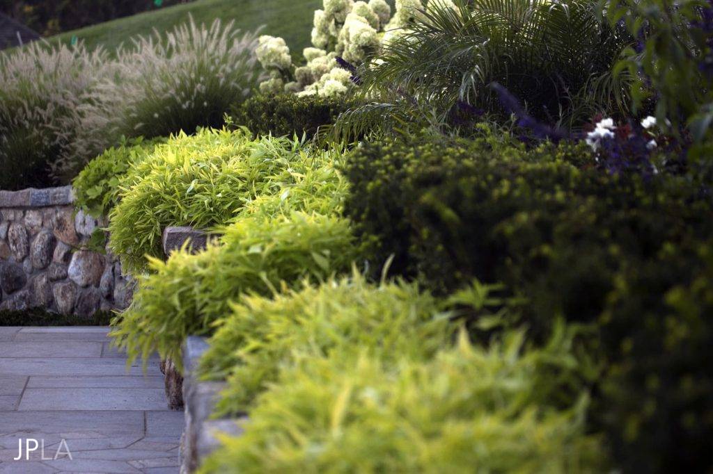
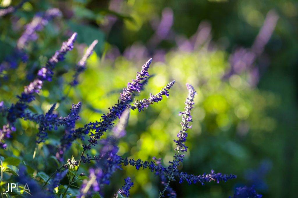
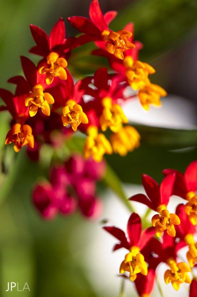
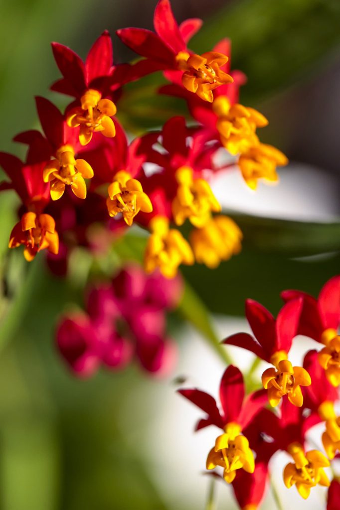
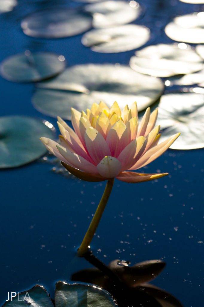
If the garden areas are close to the house it’s right to match the garden colors with the interiors and exterior furniture. It creates a relationship. Bright vibrant colors at a distance will shorten the sense of space. Yellow and red are visible, even at high noon, from about 200 feet. Blues, purples pinks all read as soft and diffused – almost gray – at a distance. Soft colors are even more diluted in the harsh midday light. To create a sense of space it is best to put soft colors at a distance and the bolder colors close to the buildings. Take a good long look at the distant views and shapes, they will all relate back to your garden color.
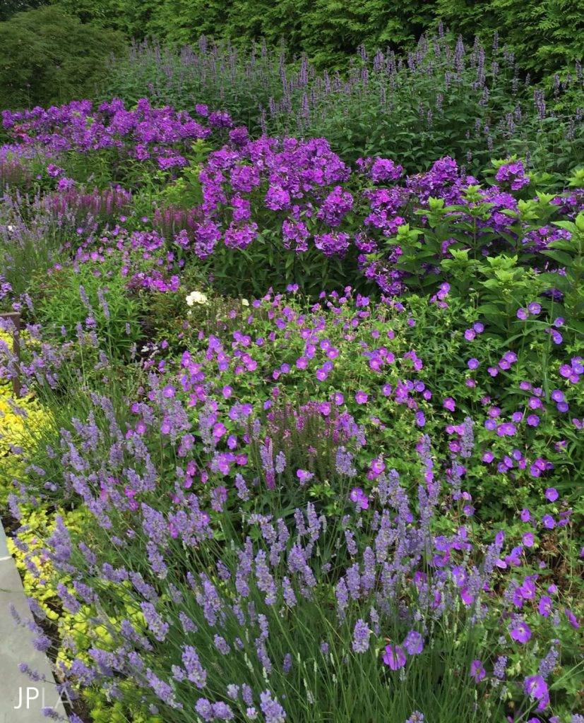
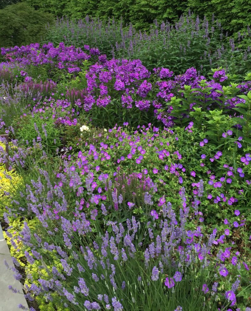
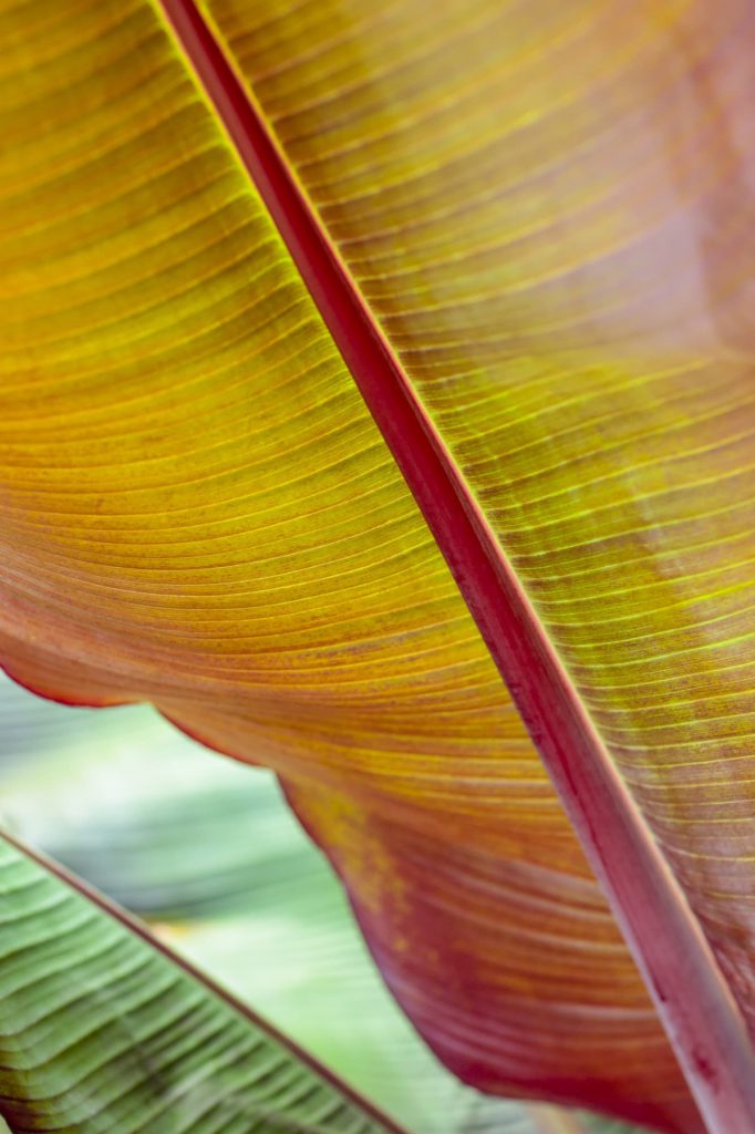
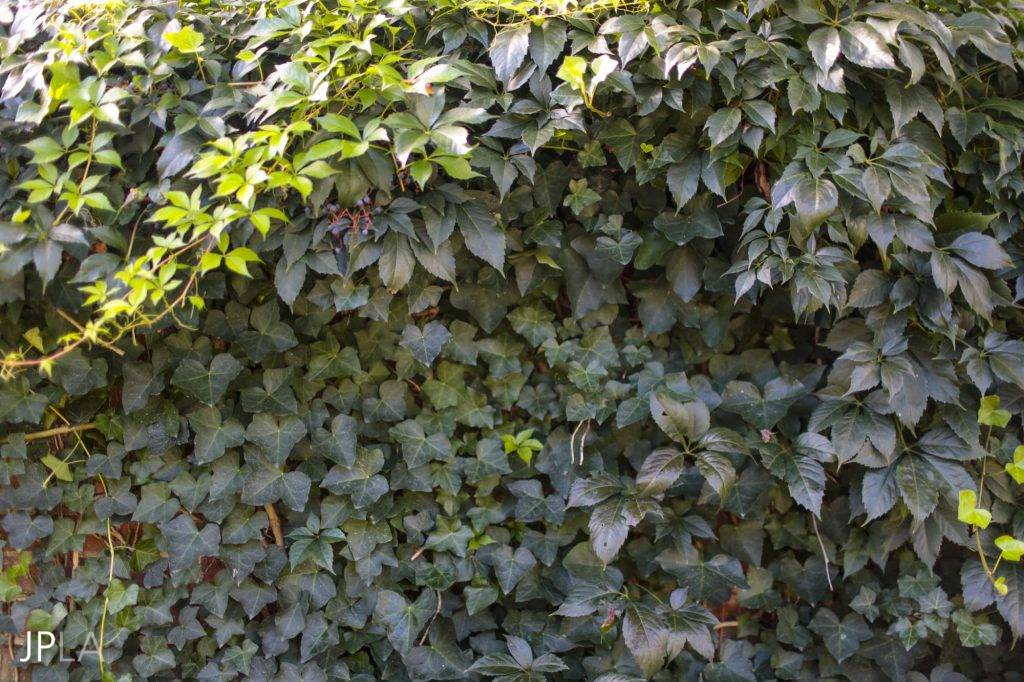
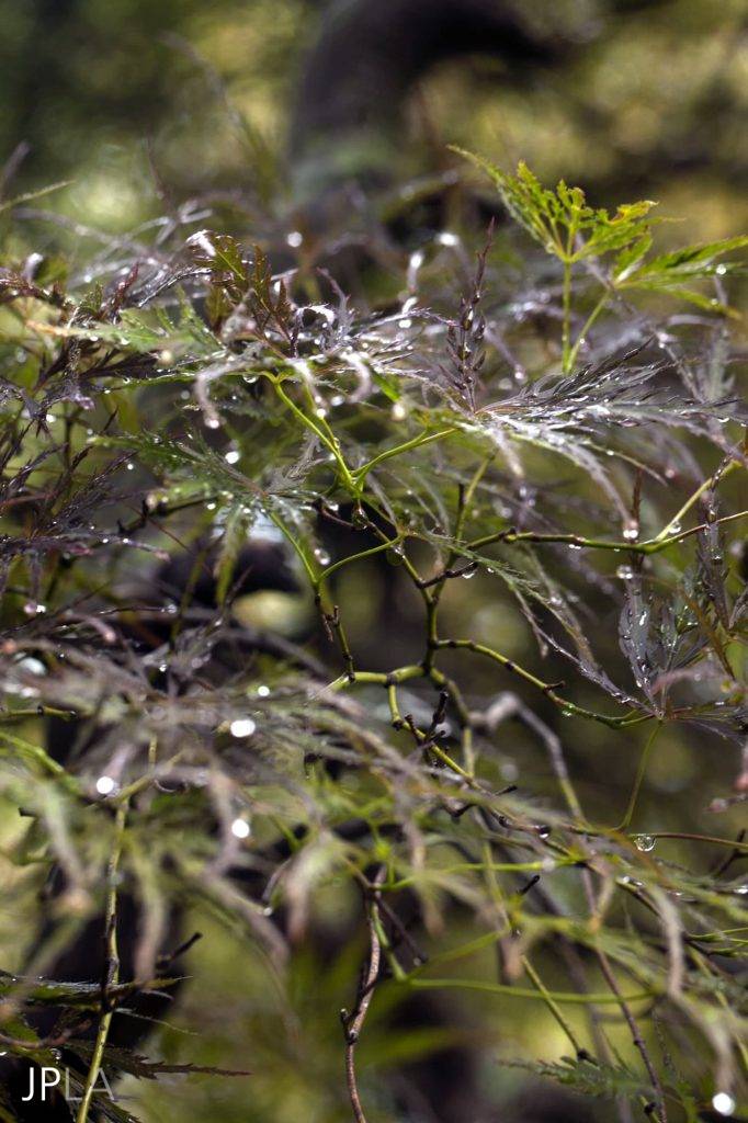
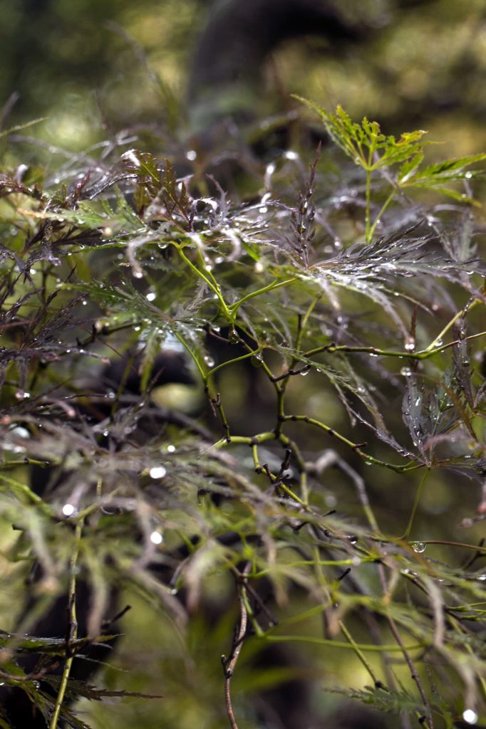
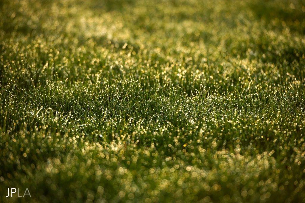
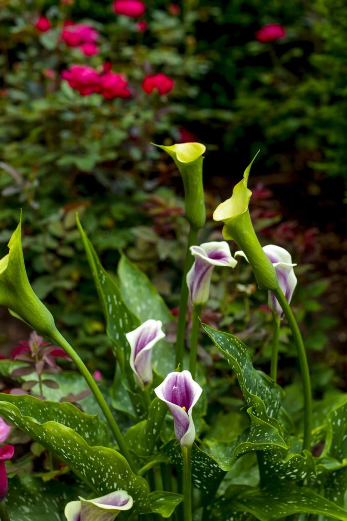
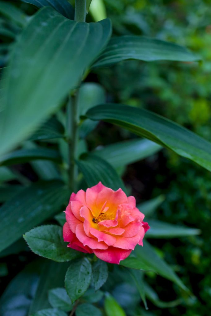
All greens are created equal and change in the different seasons. Except for urban gardens, a garden is seen with and against different shades of green. The early morning soft dewy green is quite different from the noon hazy or harsher tone and evening adds a layer of golden light and deepening hues. Nature’s colors are unique and ever changing, and this gives us a good reason to relax and loosen up about color. For those of us in northern climates, the evergreens change green tones as well — in the winter some look dark, almost black and others bronze or glaucous. Nature uses color in large swathes of the same tone and this is important to understand. But when we are designing landscapes and gardens, all bets are off. Blasts and pops of color can be exciting focal points, as well as bring us emotional responses and connections. Most great garden beds are far more diluted than a true color wheel, they become soft and artistic in the different times of day and seasons. I find the use of color to be highly personal and I respect it as such.
It’s helpful to think of color as a compliment to the garden and the design, not the focus. This will open up new ways to use color and most of all – enjoy it.
